Read AI summary
Are you looking for a digital marketing strategy to maximize your leads? Do you want an online presence but lack the resources a full website demands? Are you keen on promoting a specific product? The solution is simple: Landing Page. Stay with us to learn everything about these pages and how to use them to achieve your business goals! Don’t stop reading: it’s time to take your potential customers to the next level.
A Landing Page is a page designed to receive visitors for them to perform a specific action.
What is a Landing Page?
We’re almost halfway through the year. If you still don’t know what a Landing Page is and what it’s for, now is the best time to learn (don’t let it become your New Year’s resolution!).
And it’s not that everyone knows what a Landing Page or destination page is. Until a few weeks ago, for instance, one of our clients didn’t know either. How did he learn? Well, I explained it to him. Why did he have to learn it? Because when he asked us for a way to optimize his Ads campaigns, the solution we came up with was to create a series of Landing Pages… And the rest is history.
But let’s get to what interests you. A Landing Page is a page designed to receive visitors for them to perform a specific action. This could be buying a product, inquiring about a service, downloading content, subscribing to a newsletter, etc. Usually, this action is performed by clicking a button, filling out a form with your personal information, or both. In any case, performing the action generates a lead, turning the visitor into a potential or actual customer of your business.
Landing Pages are bottom-of-the-funnel material optimized for lead generation. Consequently, they often lead to increased chances of return on ad spend.
Of course, for all this to happen, the page must be structured around the action you want the user to perform. The best way to understand what this implies is to compare Landing Pages with Home Pages.
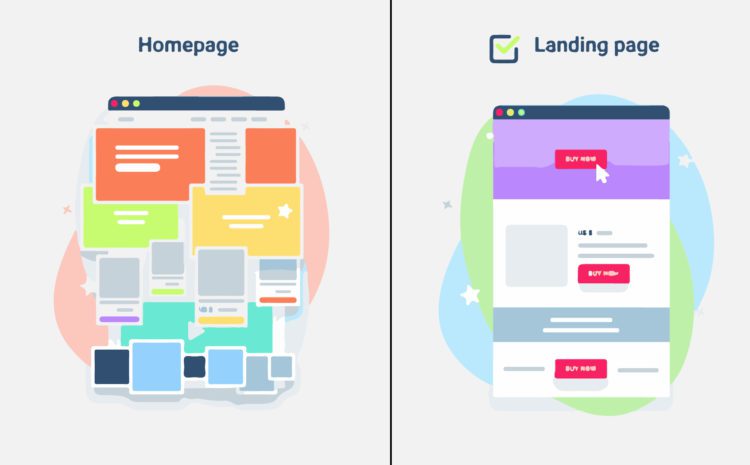
On the one hand, the Home Page (or homepage) is usually the first page you see when you enter a business’s website. It typically has a menu with links to different sections. It serves to provide general information about a business, showcase all its products and services, tell its story, among other things. It is, therefore, a page with multiple navigation sections, goals, and content.
On the other hand, a Landing Page is created to promote a specific product or service or to have the user perform a specific action. It aims to meet a specific need of the user and not all the needs a Home Page visitor might have. This implies that its design is simpler. After all, if it had many links, resources, sections, and content, the potential customer could get lost among so many options and not perform the target action.
Essential Elements of an Effective Landing Page
In Landing Pages, less is more. Or not. Really, it depends on the type of action you want the visitor to perform, the offered product, and the target audience, among other factors. In any case, there are a series of key elements that cannot be missing in a Landing Page… And you’ll learn about them if you keep reading a little more (don’t give up: having your own Landing Page is worth it).
Attention-Grabbing Headlines
The digital marketing jungle is a ruthless world where almost the only option to survive (if you don’t already have a good customer base) is to stand out. Attracting visits to your Landing Page and convincing them that performing the action you propose is necessary is not an easy task.
For now, the first impression is what counts. Therefore, it’s essential to have headlines that cannot be overlooked, as attractive as to be worth a click or two. But this is not enough. It’s important that the headline makes people feel that your product or service is right for them and, above all, describes what you are offering. All in 10 words or less.
For the latter, you can usually choose between two paths:
- Indicate what will happen when the action is performed or the action to be performed (e.g., “Buy winter boots”)
- Make a value proposition (e.g., “The boots your feet need this winter”)
In both cases, it’s crucial to clearly present what the page is offering. Whatever it is, nothing really important should be taken for granted, nor should unfulfillable promises be made. This way, you will not only avoid future problems but also generate more trust in your users.
If necessary, you can add a subtitle that doesn’t exceed 20 words. It will help highlight the advantages of performing the target action and continue persuading your users to become customers.

Attractive Images
A second method to capture the user’s attention and, at the same time, show what you are offering (whether it’s a product or service) is images.
If you are promoting a product, images can also help increase trust in your offer. Similarly, if your Landing Page aims to collect signatures for a good cause, visual elements will help generate empathy. Indeed, it’s a fact that if your Landing Page lacks audiovisual elements, the chances of the user continuing to read the content may decrease.
This doesn’t mean you always need visual elements just because. Sometimes, a good Landing Page only needs a headline, a brief description, and a call to action or form (our client couldn’t believe it either). It all depends on your offer, your audience, and the goals you want to achieve.
Description
The description on a Landing Page is a text of up to 150 characters that introduces the main features of your offer. Its content should align with your marketing campaign (if there is one) and specifically target your audience. Additionally, it should present your product or service in an attractive and compelling way so that users decide to perform the action you propose.
In the description, you can also explain what will happen when they convert: if they will receive an email, if a document will be downloaded, or whatever applies. This will help your potential customers know what to expect and builds more trust in your business.
👉 In our last article, we explained the difference between CAPTCHA and reCAPTCHA.
Clear and Compelling Calls to Action
We have already made it clear that for a visitor to become a customer, they must perform an action. How do they do it? The options can be two: either fill out a form (we’ll talk about that later) or click a button. That button and the text indicating and promoting the action to be taken are the call to action (or CTA) of your Landing Page.
How crucial are they? Well, let’s say you could have all the elements that make up a Landing Page, but if you don’t have effective calls to action, it will be difficult for people to convert. For this, you need to ensure that the calls to action on your page are:
- Clear, so that the potential customer knows what action they will take,
- Compelling, because user seduction doesn’t end when they arrive at your Landing Page.
As our client could tell you, there are several strategies to optimize the efficiency of calls to action. For example, having the button move as the user scrolls through the page. You can also include more than one type of call to action to give multiple options to visitors to your Landing Page.
However, it is also true that sometimes fewer calls to action with attractive design and clear messaging are more profitable than several without any criteria.
To strategically define how to incorporate calls to action, it’s a good idea to use heat map tools (like Hotjar or Clarity). These allow you to detect which locations attract the most attention from your visitors. They are extremely useful. However, they are no match for having the comprehensive and skilled service of a web design and digital marketing team ( 😉 😉 ).
Forms Optimized for Conversion
Last but not least, a Landing Page must have a form. Through it, you can capture your visitors’ data and build a database of users interested in your offer.
However, it is not advisable to be aggressive when asking for information. That is, the form should appear subtly and without invading the other elements that make up your Landing Page.
Additionally, the information you ask for must make sense considering your offer. As I explained to our client: It’s not the same to ask for personal data when offering “more information” in return than to ask only for the email address. If your offer is, on the other hand, a virtual catalog, the user may find it reasonable to provide, for example, their phone number.
In any case, the form will help you obtain the necessary data to determine whether the generated lead is of quality or not. Therefore, the fields you include must provide enough information to deduce it.
Keep in mind that the more fields your form has, the more accurate your deductions will be. However, it is less likely that visitors to your Landing Page will want to complete them. A good way to include longer forms without affecting the number of leads is to use smart forms that fill in automatically.
Examples of Successful Landing Pages
One of the most effective strategies for developing a Landing Page with high conversion rates is to apply benchmarking techniques. What is that? It’s studying your competition, looking for what makes their Landing Pages effective and what they could have done better. Then, you can use the results of your study as a source of inspiration.
Example of a Product Landing Page
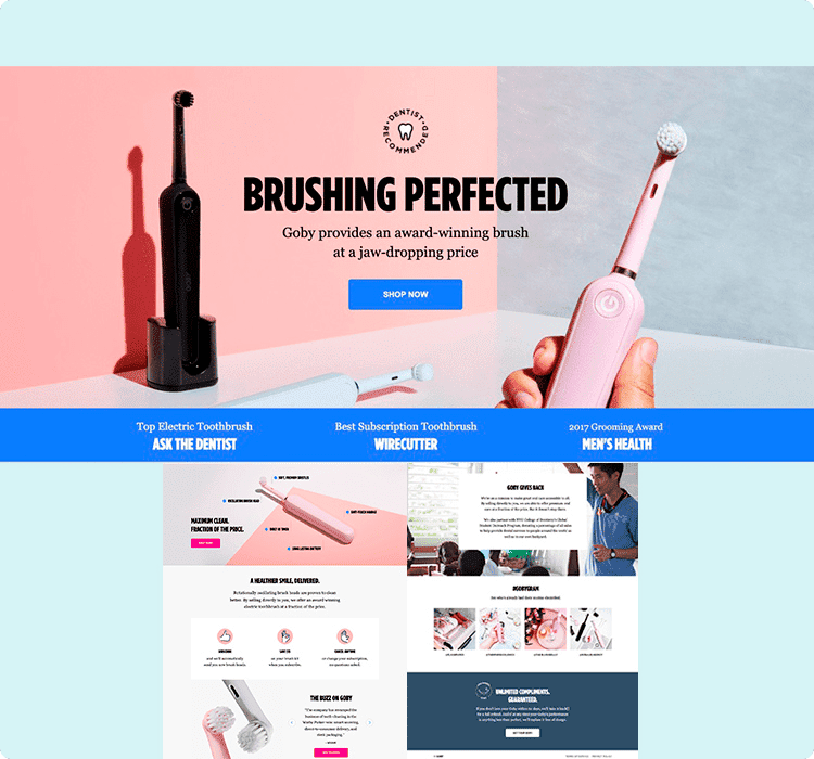
This product page provides information about its offer dynamically. We can use it as a model to organize large amounts of data by combining short text sections with multiple visual resources.
Notably, the section that makes the page a true Landing Page occupies most of the screen. Moreover, it is in the upper section and uses a larger font, which is the first thing that catches the eye.
This Landing Page has excellent examples of calls to action, title, and subtitle. First, the title makes a promise (“perfected brushing”) that the subtitle reinforces by highlighting the product’s advantages (“award-winning brush, prices that leave you speechless”). Second, the call to action clearly explains what the action to be taken consists of (“buy now”) and is in the center of the page.
All the above encourages the visitor to become a customer. The vibrant color palette and the inclusion of validation sources (“ask the dentist,” “2007 Grooming Award, Men’s Health”) help seal the deal.
Example of a Service Landing Page

Let’s look at today’s most well-known Landing Page: Netflix’s. It’s interesting to observe that, since the company doesn’t need to make itself known, the emphasis is on the offer and not on the brand.
This Landing Page is a perfect example of minimalism in design. Additionally, regarding content, it always focuses on its promise. What does it promise? Watching series and movies wherever and whenever you want. What else? Relatively affordable plans (for Europeans) and a free one-month trial.
All this is reinforced in the bullets at the bottom of the page. In this section, we find another promise: we can disconnect from the service whenever we want. But the promises don’t end there. Through the image, the Landing Page offers a service that also serves to entertain the kids at home.
Portable cinema, with various plans, and a built-in babysitter. How could we say no? And if we didn’t know how to start the free trial, the fiery red call to action, standing out against the black background, is an unmistakable signal.
Of course, the strategies used by Netflix for this Landing Page are not suitable for every company. Mainly because, beyond the free month and the possibility to cancel services, it doesn’t contain elements that help generate trust in its offer.
A lesser-known streaming company could, for example, show images of the movies and series it offers. It could also include links to Google reviews or an explanatory video of the service.
Example of an Event Landing Page
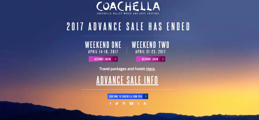
This is an example of a Landing Page full of different calls to action. Access information about a past event, learn about more sales for the event in question, links to social media profiles, find travel and hotel packages, log into your account… The options are many, which allows for a broader range of visitors to convert into leads.
For this to work, clear and concise calls to action are essential. Moreover, the page must be impeccably organized to avoid confusion. After all, the idea is for the user not to stay more than a few seconds on the Landing Page.
Using heat maps and other strategies to prioritize content is crucial. What stands out the most on this Landing Page is an announcement of interest to the general public. In this case, that the presale for the 2017 edition has ended. If one wanted to know more about it, a sizeable call to action offers additional information.
Between the announcement and the call to action, there are two buttons and a smaller link aimed at those who got presale tickets. Their position in the center of the screen helps not to overlook them.
At the bottom of the page, a series of bullets and a new call to action provide more information about the event and its past editions. This way, we can generate new opportunities to stay in touch with the user and continue encouraging them to become a lead.
One last, but significant, aspect we can observe in these Landing Page examples is that they do not use more than three different fonts. Similarly, they do not have a wide variety of colors or (except for the product Landing Page) graphic elements. Why, beyond not distracting the user? To improve the page’s loading speed. But we will talk about that later.
Types of Landing Pages and Their Specific Uses
Not all Landing Pages serve all offers. Therefore, to develop a strategic and effective marketing campaign, it’s necessary to know what options the Landing Page subworld presents.
Informative Landing Pages
This type of destination page is used to attract users who are in the early stages of the sales funnel. This is because, as they contain information about your offer, they serve to introduce it and generate interest in it. Of course, since they are not the same as a blog or website, the data is presented concisely and optimized to achieve conversions.
What kind of information should such a Landing Page contain? In truth, this depends on your offer. It’s not the same to create, for example, an informative Landing Page promoting a cruise trip as one promoting your shoe company.
It’s necessary to include enough data for visitors to resolve any doubts they may have… And a contact form in case they have questions that the Landing Page doesn’t address.
It’s also advisable to provide customer testimonials and visual resources. This helps users have a better idea of what to expect from the offer and generates more trust in the business or company.
Still, to determine what data to include, the best option is always to turn to a marketing professional team who can evaluate your case and advise you accordingly. Additionally, they can ensure that the information is articulated within a general marketing strategy, optimizing your Landing Page 100% (as we did for our client).
Lead Generation Landing Pages
Although all Landing Pages aim to generate leads, they usually fulfill another function (e.g., informing the visitor). Lead generation Landing Pages (or squeeze pages), on the other hand, only serve this purpose. Therefore, their design is the simplest there is: they only include a form and the call to action.
Visitors to a lead generation Landing Page must be just one click away from becoming customers (potential or not). Therefore, it’s ideal for them to arrive through social media, websites, paid advertising, or other means where they learn more about your offer. Additionally, the form and the call to action must be carefully designed, lest the visitor changes their mind at the last second!
Promotional Landing Pages
Let’s suppose Father’s Day, Mother’s Day, Black Friday, or the holiday season is approaching. If you have a business, there’s no better time to attract new customers by bombarding them with promotional Landing Pages.
What characterizes this type of destination page is that they are focused on a specific product or service. So, if you want to promote a particular service or have a flagship product, this type of page is ideal for distinguishing it from the rest of your offer.
A user could use a promotional Landing Page to acquire a special edition T-shirt and donate funds to an NGO. It could also serve to book tables for New Year’s Eve dinners at a restaurant or learn more about a capsule collection of designer watches.
In summary: promotional Landing Pages are precise. They aim to get straight to the point regarding their offer and the actions the user will take. They are, in this sense, the perfect complement to your Ads campaigns (as our client can attest).
Event Landing Pages
A destination page’s offers go beyond products or services. Among many other possibilities, Landing Pages serve to market event tickets, provide information about it, or promote it as part of a general marketing strategy.
Event Landing Pages (like Coachella’s, mentioned above) aim to generate excitement for their offer. Therefore, they usually provide details on what the event includes, schedules, images or videos, maps… Among other elements that convince visitors they are promoting the event of the century.
Thank You Landing Pages
After a visitor generates a lead, it’s possible to redirect them to a thank you Landing Page. This type of destination page is a more versatile option than confirmation or thank you pop-ups. For now, it offers a broader range of functions.
It can, for example, present related offers to the previous Landing Page or include buttons that take the user to the business or company’s Home Page. They can also indicate what the customer should do or expect (if not already presented in the description).
Although they are not mandatory, thank you Landing Pages help consolidate leads by valuing the customer, keeping in touch, and encouraging further actions.
Design and Development of a Landing Page
As a general rule, the design of a Landing Page must be minimalist to be simple and easy to navigate. This way, users won’t get confused by so much information and fail to complete the conversion process.
Therefore, when designing a Landing Page, it’s always advisable to ask yourself why you are including each element on the page. The same criterion applies when writing the content. If you can’t find a compelling reason for something to be on your Landing Page, you know what to do!
If you work with templates, it’s also preferable to keep the “less is more” rule in mind. Trust your judgment more than that of whoever designed the templates and remove unnecessary elements. Dropdown menus, footers, links, or an excessive number of buttons… All that must go unless they serve an important function for conveying your message.
Other factors contribute to making a Landing Page design attractive and functional. First, the color palette can (and should) reinforce a brand’s identity or convey specific associations. Second, including graphic elements (such as images and videos) is ideal for generating trust in the offer’s quality or description. Finally, directing the user to the call to action by creating focal points helps promote conversion rates.
Although theoretically, none of this is too complicated, in practice, it can become difficult. Very difficult. Therefore, we advise you to imitate our client and turn to a professional marketing and design company. This way, you will not only have the aesthetic part of your Landing Page covered but also certain technical aspects that not just anyone knows how to resolve.
Importance of Responsive Design
It’s a fact that nowadays, much of the internet browsing is done on cell phones or tablets. Therefore, if you want to ensure that your Landing Page maintains a constant level of effectiveness, it must have a responsive design.
What does this mean? It means the design must adapt to different devices without compromising the user experience. In other words: it’s time to hire a designer who can help you reach your potential customers with quality tools.
Optimizing Load Speed
Landing Pages are designed for visitors who do not plan to spend much time browsing that web page. Therefore, when generating a destination page, it’s crucial to optimize its load speed as much as possible.
There are some basic things to consider that can be done without extensive knowledge of web design and development. For example, compressing images, removing unnecessary elements, and not using more than two simple fonts.
However, a professional can see beyond the basics and apply specific techniques that make the difference between a lead and a fleeting visitor. Developing a loading strategy and creating accelerated mobile pages are, for example, effective actions that need someone knowledgeable behind them.
Using A/B Testing to Improve Conversion
A final but fundamental aspect of designing and developing a Landing Page is conducting tests to determine what works on a page and what doesn’t.
A/B testing, in particular, involves creating two versions of an element (in this case, a destination page). Half of the total traffic is sent to each version.
The success of each version will be evaluated using metrics such as the number of visits, the time spent on the page, or the number of conversions. Once the elements that make a Landing Page effective are determined, you will have data on user preferences, which points are decisive, and more!
Common Mistakes in Creating Landing Pages and How to Avoid Them
Nowadays, making mistakes is not only human. We have a second client who, at the time, asked us to optimize a promotional Landing Page that an AI had created for him. In general, it was more than fine, as is often the case with AI products. However, there were three issues that were overlooked:
Confusing or Too Long Messages
The most visible error in the AI-created Landing Page was its content. In what sense? In that, it was a bit confusing due to its artificiality. And it didn’t incite fulfilling the call to action at all. However, the text length was perfect: sentences didn’t exceed 20 words, and the total didn’t exceed 150 characters.
How to solve this error? The first option is to have an honest reader who doesn’t already know your proposal. The second option is to try different alternatives (preferably with A/B tests) until you find the one that satisfies you. The third (and final) option is to hire a professional team to take care of your Landing Page.
Lack of Usability Testing
A web page (of any kind) should not be declared finished without conducting usability tests. At least, if the goal is to prioritize the customer experience (certainly, if they have a bad experience, why would they want to convert?)
These tests are conducted through UX evaluators. They ensure smooth navigation and that the page doesn’t present problems like banner blindness, readability, or scrolling, among others.
There are various types of usability tests. Most (if not all) require a significant amount of time and resources to be carried out. Therefore, the best recommendation for solving this issue is teamwork… Or the work of a professional team.
Ignoring Mobile Optimization
The last issue the AI-created Landing Page for our second client overlooked was developing a responsive design for mobile devices. A grave error, especially considering the many opportunities this makes you lose.
For this, it’s not enough for the page to adapt to different screen sizes. It must also be considered that the buttons and links on the landing page should be easy to click on touchscreens. Additionally, it should load quickly: mobile users tend to have less patience than desktop users and, in some cases, a lower quality connection.
Beyond hiring a professional web developer or giving more precise instructions to the AI, what can we advise you? For now, simplify the design, incorporate fluid fonts, and if images are included, make sure they are scaled for different devices.
Tools and Resources for Creating Landing Pages
Can’t wait to put everything you’ve read into practice and start creating your own Landing Page? Then let us tell you about some of the best tools for creating Landing Pages you can find.
Platforms for Creating Landing Pages
Several digital tools, paid or not, allow you to create Landing Pages without knowledge of programming and web design. While their results don’t compare to what a professional can offer, they can be more than enough to meet your goals. Some of them are:
- Wix: This online website creation platform offers low-cost paid plans and a somewhat limited free version. It includes a large number of templates divided by the area for which the Landing Page is created: blog, education, events, creativity, stores, businesses, and services. From the platform, you can manage payments and analyze the efficiency of your pages. However, learning to use it takes time.
- Hubspot: This platform has a long history in the web creation world. It offers thousands of templates, including versions optimized for mobile devices. While it is generally quite intuitive to use, some of its tools require some prior experience to be implemented. Additionally, its paid plans are priced in dollars.
- Leadpages: This platform focuses on creating Landing Pages, in particular, and web pages. It provides templates sorted by their conversion rate. Furthermore, Leadpages allows integration with other digital marketing tools, lead management, and page effectiveness analysis. The downside? All its plans are paid…
- Unbounce: This platform allows you to create Landing Pages quickly and, above all, easily. It also includes a system for conducting A/B tests and AI tools. However, its template options are somewhat limited, and its plans are paid in dollars.
Analysis and Tracking Tools
As you may have read, some platforms for creating Landing Pages include page analysis among their functions. Still, it never hurts to know some tools that can help you track your Landing Pages.
- Yandex Metrica: It is a free platform for conducting comprehensive web page analyses. It is relatively easy to use. It allows retrieving data on a Landing Page’s traffic, audience and behavior, and page performance. The reports it generates are customizable and accept various filters to analyze different sample segments.
- Statcounter: This analysis tool is used to study a Landing Page’s conversion rates and traffic trends. It also has the option to identify if a visitor returns to a certain Landing Page or generates leads more than once on it. It offers paid plans (in euros) and a free plan that analyzes the last 500 visits to a page.
- VWO: VWO is an analysis platform that includes programs for conducting A/B tests and studying user behavior. They apply to both computers and mobile devices, making it a rather complete option. It offers a free version and paid plans, as well as paid add-ons.
Resources for Inspiration and Templates
Do you want to find examples of Landing Pages and templates without having to search the entire Internet or sign up for a platform? There are three pages that can serve you:
- Envato Elements: Paid repository that allows free previews. It contains over 2000 downloadable Landing Page templates and countless creative resources.
- Mailerlite: This digital marketing platform can be used to create Landing Pages. Some of these are featured in a free gallery that can be visited to learn about Mailerlite’s services and, above all, seek inspiration.
- Landing Gallery: The platform to find examples of destination pages is Landing Gallery. As they are organized by page type and the tools used to develop them, it allows you to reach specific Landing Page examples. Thus, apart from a good dose of inspiration, it provides the opportunity to evaluate the possibilities offered by different Landing Page creation platforms.
Conclusions
In summary, Landing Pages are a relatively economical and versatile resource that, if crafted and maintained carefully, can offer considerable returns. They are great allies in achieving the goals a business needs, especially for small and medium-sized companies and those looking to enter the market.
Did you reach this point eager to open an account on Leadpages or Hubspot and create your own Landing Pages? Don’t wait any longer! After all, life is short, and you must make the most of it. Don’t forget to come back and share your experience with us. If you liked this article, you can also subscribe to find more useful content.
But what if you’re tempted to hire a professional service and get advice… or a custom-made Landing Page? Contact us! At MD Marketing Digital, we have a team of specialists in creating websites and developing comprehensive marketing strategies.
We know how to combine functionality and design to create optimized Landing Pages to achieve your goals. We have various alternatives that suit your needs to offer you the most complete service possible.
Don’t miss a single opportunity! Your Landing Page is waiting for you.

- What is an SEO specialist? - April 6, 2026
- The Ranking of Best SEO Agencies in Argentina in 2026 - January 23, 2026
- The Ranking of the Best Digital Marketing Agencies in Argentina in 2026 - January 12, 2026
¿Qué te pareció este artículo?
What do you think about this post?